Remember YouTube annotations? If you were watching videos between 2008 and 2017, you couldn't miss them. They were those clickable, semi-transparent text boxes that would pop up mid-video, almost like digital sticky notes creators could place right on top of their content.
Think of them as the ghost of YouTube past—a foundational tool for engagement back when the platform was a desktop-first world.
The Ghost of YouTube Past: Understanding Annotations
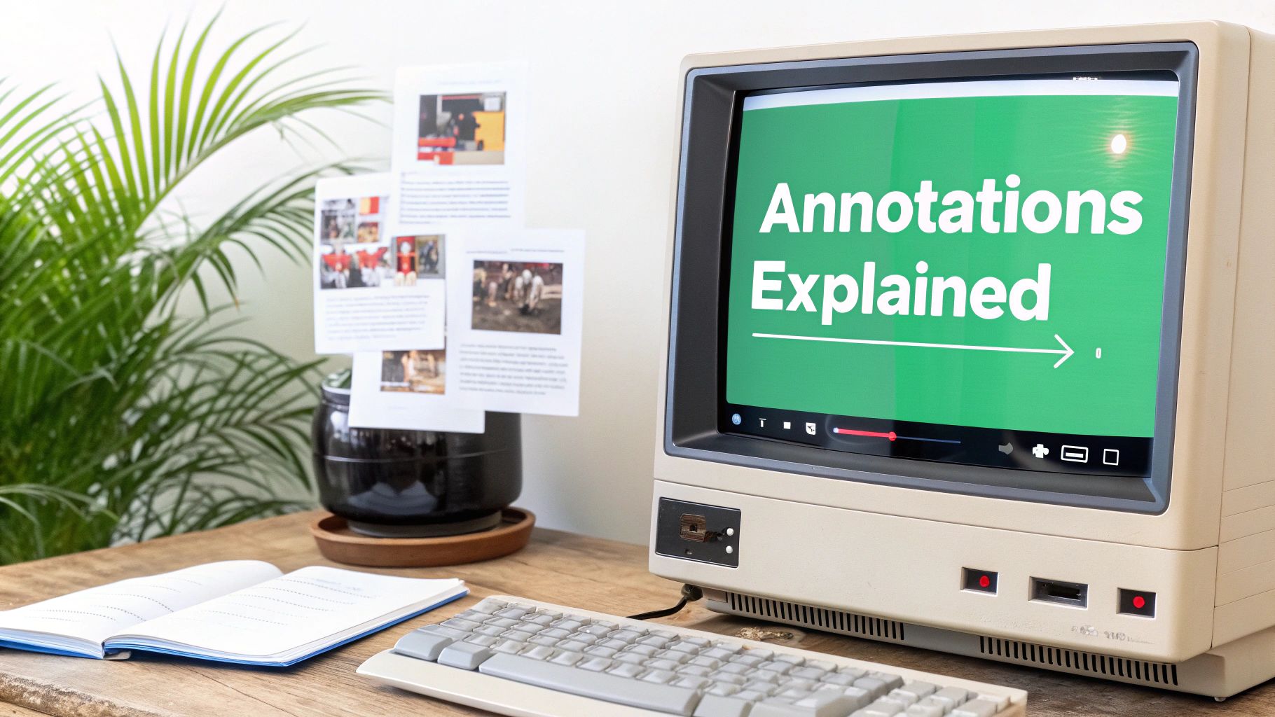
Long before we had sleek Cards and End Screens, annotations were the go-to for making videos interactive. They were essentially a layer placed over the video player that could contain text, links, and even invisible "spotlight" areas that became clickable when a viewer hovered their mouse over them.
For a long time, this was the only way a creator could directly guide a viewer's journey—sending them from one video to the next or even off-platform to a website.
What Were Annotations Actually Used For?
Creators got pretty creative with this tool. Annotations were the original call-to-action (CTA) system, handling jobs that are now split among several different, more polished features.
Here’s what they were mainly used for:
- Linking to Other Videos: This was huge for series. A creator could drop a link at the end of an episode to send viewers straight to the next one, creating a primitive, in-video playlist.
- Subscribing to a Channel: That classic "Click Here to Subscribe!" box was a powerful and direct tool for growing a channel's audience.
- Correcting Mistakes: If a creator misspoke or got a fact wrong, they didn't have to re-upload the entire video. They could just pop in a small text annotation to set the record straight.
- Adding Commentary: They were perfect for adding witty asides, extra trivia, or little behind-the-scenes facts without interrupting the flow of the video.
- Driving External Traffic: Once a creator verified their channel, they could use annotations to link out to their own websites, turning views into potential customers or blog readers.
Annotations were a creator's first real toolkit for on-screen engagement. They were a direct line of communication, allowing for interactive storytelling and audience direction in a way that was groundbreaking for YouTube at the time.
While it's hard to track down exact data on their usage now, their impact on early YouTube culture is undeniable. Their removal signaled a huge shift in how YouTube thought about user experience, paving the way for the mobile-first tools we have today. This legacy still shapes modern features focused on navigation, which is why knowing how to link to a specific time on YouTube remains such a vital skill for creators.
Why YouTube Pulled the Plug on Annotations
If you were on YouTube in its early days, you definitely remember annotations. They were a wild, defining feature of the platform. But by the mid-2010s, it was obvious their time was up. Even though they gave creators a ton of freedom, they were built for a world that was quickly vanishing—one where everyone watched videos on a desktop computer.
The single biggest reason for their downfall? The unstoppable takeover of mobile.
This wasn't just a small shift; it was a total revolution in how we watch videos. By 2017, the year YouTube stopped letting creators make new annotations, mobile devices were already pulling in over 70% of all YouTube watch time. The problem was that annotations, built on old Flash technology, were completely broken on smartphones and tablets.
This created a jarring, inconsistent experience. The vast majority of viewers simply couldn't see the interactive elements. For creators, it meant a key part of their engagement strategy was invisible to most of their audience. For viewers, it was just plain confusing when a creator would say, "Click the box right here!" and there was no box to be found.
More Than Just a Mobile Problem
While the move to mobile was the final nail in the coffin, it wasn't the only issue. Let's be honest, annotations had earned a reputation for being clunky and, at times, incredibly annoying.
Creators could plaster huge, screen-blocking boxes all over their content, frustrating viewers who just wanted to see the video. This gave annotations a bad rap as a tool for spam and intrusive pop-ups. Their whole design just felt dated, cluttering up the clean, modern look that other platforms were moving toward.
Ultimately, these were the problems that sealed their fate:
- A Broken Mobile Experience: They were completely useless on mobile, which had become the main way people watched YouTube.
- Poor User Experience: Annotations could be incredibly obtrusive, covering up huge parts of the video and ruining the viewing experience.
- Spammy and Untrustworthy: The feature was often abused for spammy links or obnoxious pop-ups that eroded viewer trust.
- Outdated Tech: Their reliance on Adobe Flash made them incompatible with modern web standards and a potential security risk.
On January 15, 2019, YouTube officially shut the feature down for good, removing every single annotation from every video on the platform. It wasn't just an update; it was the end of an era. This forced creators and the platform itself to find cleaner, more integrated, and mobile-friendly ways for viewers to interact.
Understanding what annotations were and why they disappeared is key. It tells you everything you need to know about YouTube's philosophy today: every feature must work seamlessly on every device and make the viewing experience better, not worse. This necessary evolution paved the way for the polished, effective tools we have now, like Cards and End Screens.
Meet The Modern Replacements: Cards and End Screens
When YouTube bid farewell to annotations, it didn't just leave creators in the lurch. Instead, it rolled out smarter, sleeker, and mobile-friendly tools built for how people actually watch videos today. These successors, YouTube Cards and End Screens, are now the go-to tools for engaging your audience and keeping them on your channel.
Think of them as two distinct tools for two different moments in a viewer's journey. One is a subtle nudge during the video, while the other is a big, bold call-to-action right at the end. Mastering both is a core skill for anyone serious about figuring out how to promote a YouTube channel.
This whole shift happened for one big reason: the world went mobile.
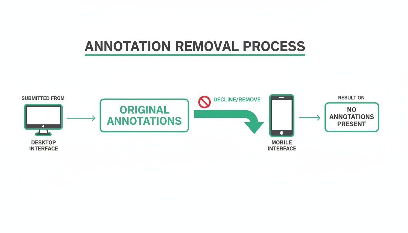
As this visual shows, the industry moved from a desktop-first world to a mobile-dominated one. Clunky, desktop-only features like annotations just couldn't keep up.
YouTube Cards: The In-Video Nudge
Ever noticed that little white circle with an "i" that discreetly appears in the top-right corner of a video? That's a YouTube Card. Give it a click, and a small, interactive panel slides out.
Cards are designed to be almost invisible until they're needed. You can set them to pop up at specific timestamps to offer timely info without plastering over your video content. This makes them perfect for context-sensitive suggestions that add value right when it's most relevant.
Creators generally use Cards for a few key things:
- Suggesting related videos or playlists: If you mention a topic you've covered before, a card can appear at that exact moment, linking viewers directly to it.
- Promoting another channel: Perfect for collaborations, you can use a Card to give a shout-out to another creator.
- Running quick polls: Want to get your audience's opinion on something? Cards can host simple polls to boost interaction.
- Linking to approved websites: For channels in the YouTube Partner Program, Cards are a great way to send viewers to your official merch store or blog.
Cards are basically the modern, interactive version of a helpful footnote. They’re a clean, unobtrusive way to point viewers toward more content precisely when it makes sense, improving the experience instead of interrupting it.
YouTube End Screens: The Grand Finale
If Cards are the subtle nudge, End Screens are your big finish. These are customizable graphic elements that pop up during the last 5 to 20 seconds of your video, giving viewers clear, clickable next steps.
Unlike the quiet nature of Cards, End Screens are designed to grab attention right as the viewer is deciding what to do next. This is your single best chance to keep them on your channel and turn a one-time viewer into a loyal subscriber.
A solid End Screen usually combines a few key elements:
- A Subscribe Button: A clickable circle with your channel icon that makes subscribing a one-click affair.
- Video or Playlist: You can feature another video, a whole playlist, or let YouTube's algorithm pick the "best for viewer" option.
- Channel Link: A great tool for promoting a second channel or a collaborator's page.
End Screens are the digital answer to the classic sign-off, "Don't forget to like and subscribe!" They turn that verbal plea into an actionable, on-screen prompt, transforming the end of your video from a potential drop-off point into a powerful growth engine.
YouTube Annotations vs Modern Tools: A Feature Comparison
To really understand the evolution, it helps to see these tools side-by-side. The old annotations were a bit of a wild west—powerful in some ways but clunky and limited in others. The new tools are far more streamlined and reliable, though they offer a more curated set of options.
Here’s a breakdown of how they stack up:
| Feature | Legacy Annotations | YouTube Cards | YouTube End Screens |
|---|---|---|---|
| Placement | Could be placed anywhere on the video frame. | Appears as a small "i" icon in the top-right corner, expanding when clicked. | Appears in a designated area during the final 5-20 seconds of the video. |
| Appearance | Highly customizable text boxes, speech bubbles, and spotlights with various colors and sizes. | Standardized, clean interface. Displays a title, custom image, and a call-to-action. | Visually engaging templates with space for video thumbnails, a subscribe button, and channel links. |
| Mobile Support | No. They were desktop-only, which was their biggest flaw. | Yes. Fully functional and designed for both mobile and desktop viewing experiences. | Yes. Designed to work seamlessly across all devices, including mobile phones and tablets. |
| Functionality | Could link to other videos, playlists, channels, subscription pages, and fundraising projects. | Can link to videos, playlists, channels, polls, and approved external websites (for partners). | Can link to videos, playlists, channels, and a subscribe button. |
| Interactivity | Viewers could click directly on the annotation box within the video. | Requires viewers to first click the "i" icon and then the card's link. | Elements are directly clickable, providing a clear call-to-action at the video's conclusion. |
| Disruptiveness | Often intrusive and could cover significant portions of the video content, leading to a poor UX. | Minimally disruptive, designed to be an unobtrusive suggestion. | Intentionally prominent to guide the viewer's next action but only appears at the very end. |
Ultimately, the shift from Annotations to Cards and End Screens reflects YouTube's focus on a clean, consistent, and mobile-first user experience. While some of the creative freedom of annotations was lost, the new tools provide a much more effective and reliable way to guide viewers and grow a channel in the modern era.
How to Use YouTube Cards for Maximum Impact
While YouTube Cards are a much simpler tool than the old annotations, there’s an art to using them well. Just tossing them into your video at random moments isn't going to move the needle for your channel. The real magic happens when you place them strategically, adding value at the exact moment a viewer needs it.
Think of a Card as a perfectly timed suggestion from an expert who knows just what you're thinking. If you mention a concept you’ve already covered in another video, that’s your cue. A card should pop up right then, giving curious viewers a seamless path to dive deeper. This is what turns a simple pop-up into a powerful tool for engagement.
Remember, you're limited to just five cards per video, so you have to make every single one count. Bombarding your audience with constant pop-ups is a surefire way to get them to tune out. Instead, space them out logically and save them for your most critical calls to action.
Building a Smart Card Strategy
A great card strategy is about more than just linking to other videos. Cards are surprisingly versatile and can help you hit different goals throughout your content. By mixing and matching card types, you can keep your audience engaged in a bunch of different ways.
Here are a few of the most effective ways to put them to work:
- Reinforce a Topic: Link to a video that offers more context or a beginner’s guide to a term you just dropped. This is a great way to support viewers who are at different points in their learning journey.
- Create a Binge-Worthy Series: If your video is part of a playlist, use a card to link directly to the whole series. This is one of the absolute best ways to rack up session watch time.
- Get Instant Audience Feedback: Use a poll card to ask viewers a direct question about your content. Not only does this get them clicking, but it also gives you fantastic ideas for future videos.
The most successful creators don't just place cards; they announce them. A simple verbal cue like, “I actually did a whole video on that, which you can check out in the card up here,” can dramatically boost your click-through rates.
Measuring and Refining Your Approach
Your job isn't over once you hit "publish." The real strategy begins when you dig into the data in YouTube Analytics. This is where you find out what your audience actually responds to, rather than just what you think they will.
Just head into your video's analytics and find the "Cards" report. This dashboard shows you exactly which cards are getting clicks and which are being totally ignored. Pay close attention to your top performers. What made them so effective? Was it the timing? The verbal callout? The topic itself?
Use what you learn to refine your strategy for future videos. If poll cards are consistently getting high engagement, lean into them more often. If links to a certain type of video always fall flat, try a different approach. This constant cycle of trying, measuring, and tweaking is what turns Cards from a simple feature into a growth engine for your channel.
Mastering End Screens to Grow Your Channel
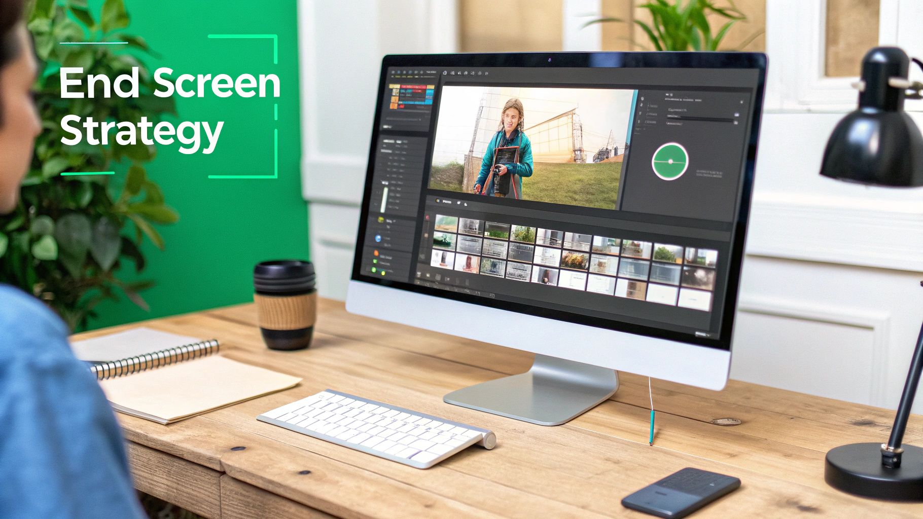
The last 5 to 20 seconds of your video? That’s some of the most valuable real estate you own on YouTube. It's the exact moment a viewer decides whether to click away or dive deeper into your world. A well-crafted End Screen turns this critical drop-off point into a powerful engine for channel growth.
Unlike the clunky, often distracting annotations of the past, End Screens are built to feel like a natural and helpful conclusion. They give your audience a clear, clickable path to whatever you want them to do next, whether that's subscribing or watching another video.
Think of your End Screen as a friendly usher at a movie theater pointing you toward the next exciting show. It doesn't just stop the video; it kicks off the viewer's next journey with your channel.
Designing a High-Converting End Screen
A great End Screen isn't just a pre-made template; it's a strategic choice. You need to pick elements that line up with your video's specific goals and what you know your audience wants to see. The whole point is to make their next click an easy, almost obvious decision.
Here are the key elements you can mix and match to create that perfect final pitch:
- The Subscribe Element: This one is a must-have. A big, clickable icon of your channel logo makes it dead simple for someone who just enjoyed your video to become a subscriber.
- A Specific Video or Playlist: Did you just wrap up part one of a series? Link directly to part two. You can also point viewers to your most popular video or a curated playlist to keep them binge-watching.
- YouTube's Recommendation: Feeling lucky? Let the algorithm do the heavy lifting. You can choose the "Best for viewer" option, and YouTube will dynamically select a video from your channel based on that specific person's viewing history.
To make this all feel seamless, you have to plan for it. When you're scripting, leave a little breathing room at the end so your End Screen can pop up without covering anything important. A lot of creators even design a custom background graphic for their final seconds to neatly frame these clickable elements.
Your End Screen is your final handshake with the viewer. It should be firm, confident, and guide them directly to where you want them to go next. A weak or non-existent End Screen is like walking away mid-conversation—it leaves the viewer hanging.
Scripting for a Seamless Transition
The best End Screens don't just appear out of nowhere; they're introduced. A smooth handoff from your main content to your call-to-action is absolutely vital. Use a simple verbal cue to direct your audience's attention.
Try something like, "If you enjoyed this video, you'll love the next one in the series, which you can click right over here."
This simple act of telling people what to do next massively increases the chances they'll actually do it. When you pair a strong visual layout with a clear verbal call-to-action, you've got a seriously effective finale. And while you're focused on on-screen engagement, don't forget the backend work of optimizing your video's visibility with effective tag strategies to pull in a wider audience. This one-two punch is how you turn casual viewers into a dedicated community.
Going Beyond Links with Video Chapters
While Cards and End Screens did a great job replacing the linking functions of old-school annotations, another modern feature took things in a totally different direction. Instead of focusing on sending viewers away from your video, it was designed to improve their experience right where they are.
That feature is Video Chapters, and it supercharges navigation within the video itself—something annotations could never do.
Think of chapters as a digital table of contents for your video. By adding simple timestamps to your description (like 0:00 Intro and 1:30 Main Topic), you slice your content into easy-to-navigate, titled sections. Viewers see these segments right on the timeline, can hover to see what's coming up, and jump straight to the parts that matter most to them.
How Chapters Boost Viewer Retention
For long-form content—think tutorials, podcasts, or deep-dive reviews—chapters are an absolute game-changer. No one wants to scrub through a 45-minute video to find one specific answer. Chapters empower your audience to navigate with precision, which cuts down on frustration and makes them far more likely to stick around.
By making your content more accessible and less intimidating, chapters can lead to a notable increase in total watch time. Viewers who might have clicked away are more likely to stay and explore different sections of your video.
This improved navigation also makes your content more valuable as a resource. When a viewer can easily revisit a key point or share a link to a specific moment, your video becomes something they can return to again and again. This is a core part of creating truly helpful, evergreen content. For a full breakdown, check out our complete guide on YouTube chapters.
Unlocking SEO Benefits with Chapters
Beyond helping your current audience, chapters are also a powerful tool for SEO. When your video is chaptered, Google can pull those segments out and display them as “Key Moments” directly in the search results.
This means someone searching for a specific topic you covered can see a link that takes them to the exact timestamp in your video where you discuss it.
This feature makes your video far more visible on Google, attracting new audiences who are looking for specific answers. By breaking down your content for search engines, you seriously boost your discoverability and frame your video as a direct solution to a user’s problem. It's a huge step up from the basic "what is annotation in YouTube" era to a smarter, more integrated way of guiding viewers.
Got Questions About YouTube Annotations? We've Got Answers.
Still scratching your head about what those old YouTube annotations were all about, or how today's tools stack up? Let's clear things up with some straight-to-the-point answers.
Can I Still See Old Annotations on YouTube Videos?
Nope, not a chance. As of January 15, 2019, YouTube pulled the plug on annotations for good. They were permanently stripped from every single video on the platform, no matter when it was uploaded. The feature is completely gone.
Are YouTube Cards Better Than Annotations?
For today's audience, absolutely. Cards are a massive upgrade because they work flawlessly on mobile, which is where most people watch YouTube anyway. They’re also way less obnoxious and give you a ton of useful data in your YouTube Studio dashboard.
Sure, old-school annotations let you plaster custom text all over the screen, but Cards deliver a much cleaner, more professional experience that actually works on every device.
How Many Cards Can I Add to a Video?
You can add up to five Cards to any given video. The trick is to use them wisely. Don't just spam them in. Place them at moments where they genuinely add value, so they feel helpful instead of just being a distraction.
Ready to get your videos noticed? TimeSkip uses AI to create perfectly optimized chapters in seconds. You'll boost your video's visibility and keep viewers hooked. Give it a try for free and see the difference it makes.