In the crowded world of YouTube, your thumbnail is your first, and often only, chance to make an impression. It’s the digital billboard for your content, a visual promise of the value, entertainment, or information held within. While creators spend hours perfecting a video's content, the thumbnail can be an afterthought, a critical mistake that leaves countless views on the table. A high-impact thumbnail can dramatically increase your Click-Through Rate (CTR), which is a key signal to the YouTube algorithm that your content is engaging and worth promoting to a wider audience.
This article moves beyond generic advice to provide actionable, data-backed strategies. We will break down 8 proven YouTube thumbnail best practices used by top creators to turn casual browsers into dedicated viewers. You will learn the specific techniques required to design visuals that capture attention and drive clicks.
From the psychology of color and composition to the practicalities of A/B testing and mobile-first design, each point is crafted to be immediately applicable. Whether you are a podcaster, educator, or marketer, these insights will help you master the art and science of creating thumbnails that don't just get seen, but get clicked.
1. High Contrast and Bold Colors
In the fast-paced, visually dense environment of YouTube, your thumbnail’s primary job is to interrupt the scroll. The most effective way to achieve this is through the strategic use of high-contrast and bold colors. This practice involves selecting a color palette that not only grabs attention but also ensures the core elements of your thumbnail, like your face or key text, are instantly legible. Think of it as visual shouting; you’re using color to make your video impossible to ignore among a sea of competitors.
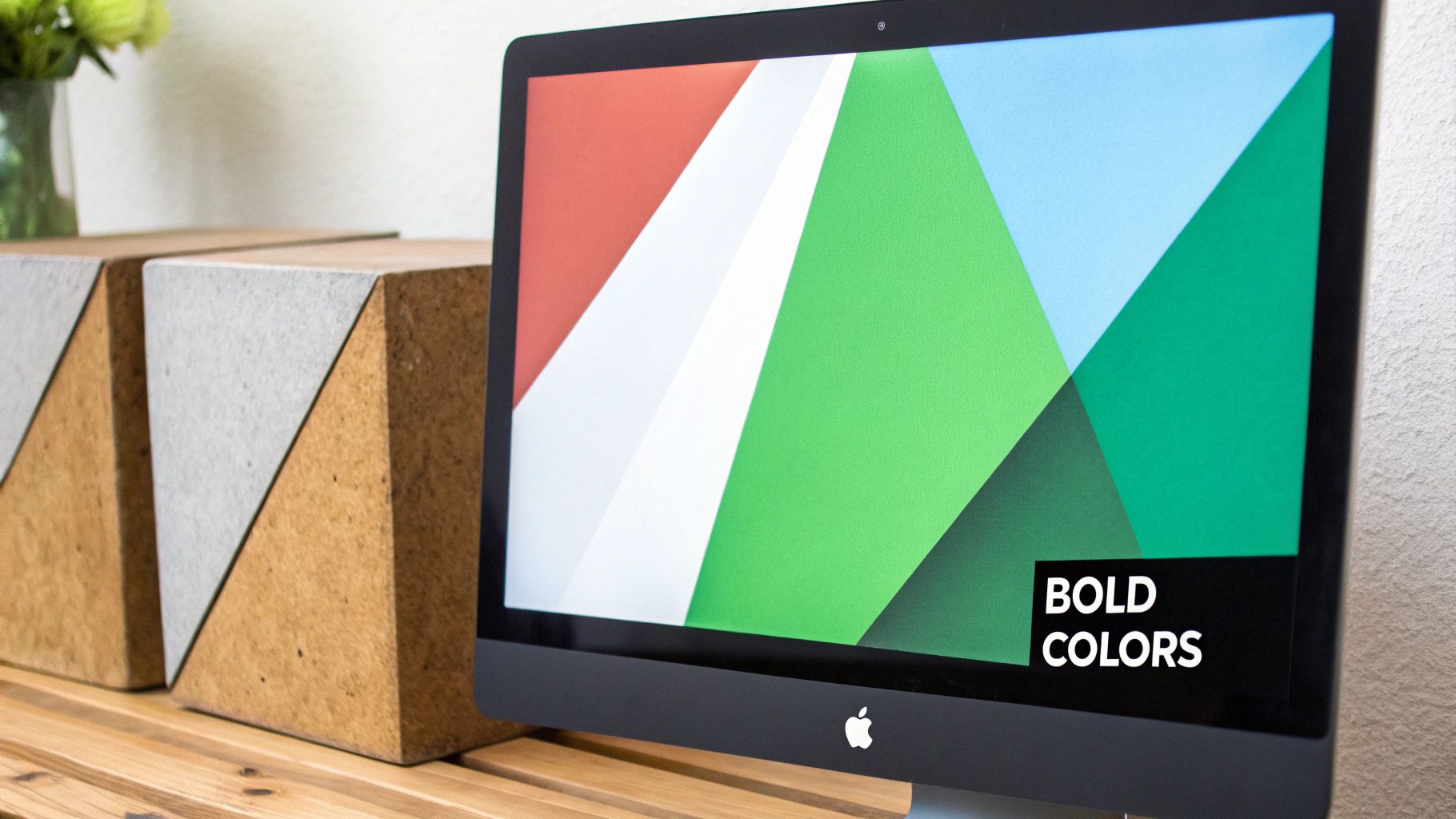
Creators like MrBeast have mastered this, consistently using vibrant yellows, cyans, and reds that pop against both YouTube's light and dark modes. The goal is to create a strong visual hierarchy where the most important subject matter is clearly separated from the background. This isn't just about being loud; it's a foundational element of effective visual communication and one of the most critical youtube thumbnail best practices to implement.
How to Implement This Strategy
- Test for "Squint" Readability: Before publishing, shrink your thumbnail down to the size of a mobile phone screen and squint your eyes. Can you still clearly make out the main subject and colors? If it becomes a blurry mess, your contrast is too low.
- Leverage Color Psychology: Colors evoke emotion. Use bright red or yellow to create a sense of urgency and excitement for challenge videos. Employ a high-contrast blue and white scheme to build trust and convey professionalism for educational or tech content.
- Utilize Online Contrast Checkers: Use free tools like Adobe Color's contrast checker to ensure your text and foreground elements meet accessibility and readability standards against your chosen background. This guarantees clarity for all viewers.
- Apply the 60-30-10 Rule: For a balanced yet vibrant design, allocate 60% of your canvas to a dominant color, 30% to a secondary complementary color, and 10% to a bold accent color that draws the eye to a specific focal point.
2. Clear, Readable Text Overlay
Beyond compelling colors, the most direct way to communicate your video's value proposition is through a clear, readable text overlay. This practice involves adding a few impactful words in a large, bold font that viewers can understand in a fraction of a second, even on a small mobile screen. Your image creates intrigue, but your text provides context, answering the viewer's crucial question: "What is this video about, and why should I click?" It’s a direct pitch that complements your visual storytelling.

Creators like Graham Stephan and Marques Brownlee (MKBHD) excel at this. Stephan uses huge, high-contrast numbers to signify monetary value, while Brownlee clearly labels the product being reviewed. This isn’t just about adding words; it’s about crafting a headline that summarizes the core promise of your content. Mastering this technique is one of the most powerful youtube thumbnail best practices for immediately clarifying your video’s topic and boosting click-through rates.
How to Implement This Strategy
- Follow the "6-Word Rule": Aim to use six words or fewer to convey your message. Any more than that, and the text becomes too small or cluttered to be read quickly. Think of it as a micro-headline, not a sentence.
- Choose Bold, Sans-Serif Fonts: Select fonts designed for maximum readability, such as Impact, Arial Black, or Montserrat Extra Bold. Avoid thin, decorative, or script fonts that are difficult to decipher at a glance.
- Create Visual Separation: Make your text pop by adding a solid-colored background shape behind it, a thick outline (stroke), or a subtle drop shadow. This ensures readability against any complex background image.
- Mind the "Safe Zones": Be mindful of YouTube's interface elements. Avoid placing critical text in the bottom-right corner where the video timestamp will cover it. The top-left or center are often the safest and most effective placements.
3. Expressive Facial Expressions and Human Elements
Humans are instinctively drawn to other human faces, a powerful psychological trigger that you can leverage to stop the scroll. Including a clear, expressive face in your thumbnail creates an immediate emotional connection and conveys the video's tone before a viewer even reads the title. An exaggerated expression of shock, joy, confusion, or curiosity acts as a powerful non-verbal hook, making potential viewers want to know what caused such a strong reaction.
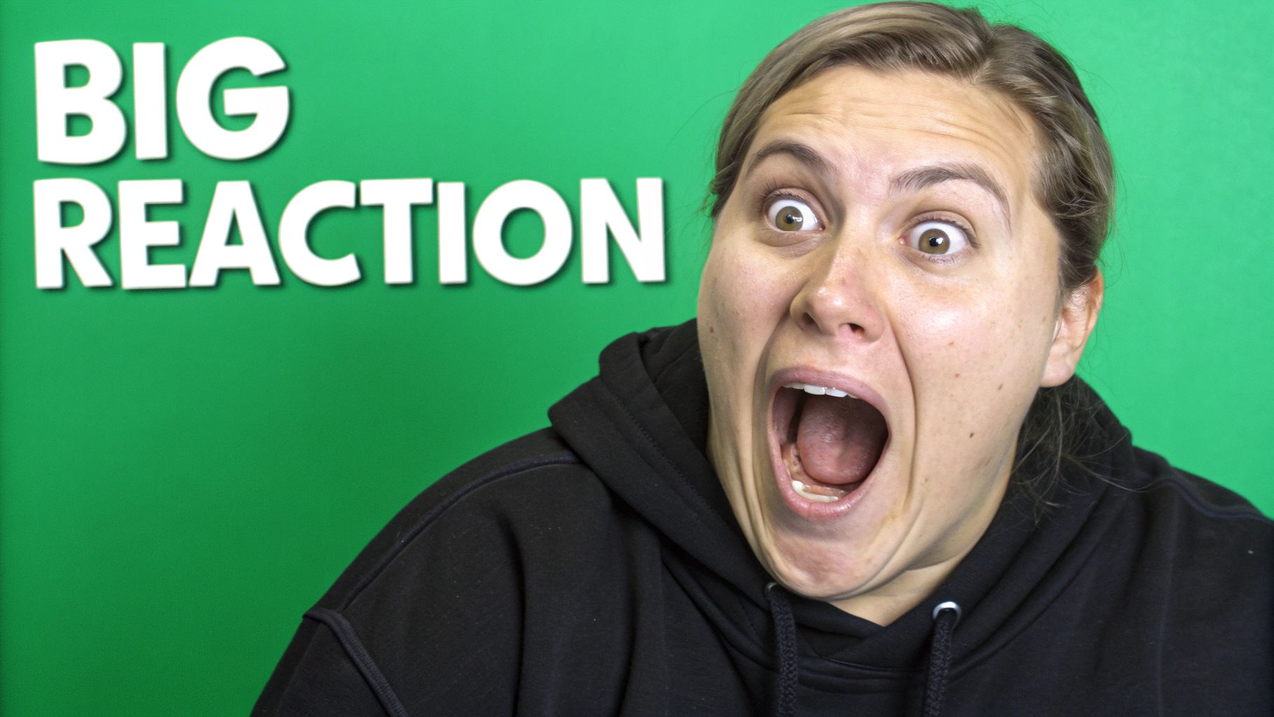
Creators like Emma Chamberlain and David Dobrik built their brands on this principle, using authentic and often over-the-top expressions to communicate the candid, relatable energy of their content. This is more than just putting a selfie in your thumbnail; it’s about storytelling through emotion. A well-executed human element makes your video feel more personal and less like a sterile piece of content, a crucial factor in building a loyal community and one of the most effective youtube thumbnail best practices for audience connection.
How to Implement This Strategy
- Match the Emotion to the Content: Ensure your expression is an authentic reflection of the video's most compelling moment. A look of shock for a surprise reveal or a face of intense concentration for a difficult challenge will feel genuine and intriguing.
- Emphasize Clear Lighting: Your face needs to be well-lit to clearly communicate the emotion. Use a key light or a ring light to illuminate your facial features and avoid shadows that might obscure your expression. Quality lighting is a cornerstone of great thumbnails; learn more about video production best practices to elevate your setup.
- Position for Impact: Place the face on one side of the thumbnail, typically following the rule of thirds. This leaves clear space for text or other graphic elements while keeping your expression as the primary focal point.
- Capture Multiple Options: Don't rely on a single photo. During your shoot, capture a range of expressions from slightly curious to wildly exaggerated. This gives you a variety of options to test in your design phase to see which one has the most impact.
4. The Rule of Thirds and Visual Composition
Beyond bold colors and text, the underlying structure of your thumbnail determines its professional quality and visual appeal. The rule of thirds is a fundamental design principle that can transform a chaotic image into a balanced and engaging composition. It involves mentally dividing your thumbnail into a 3x3 grid and placing key elements along these lines or at their intersections, creating a more natural and dynamic feel that guides the viewer's eye.

Creators in visually-focused niches, like photographers Peter McKinnon and Thomas Heaton, use this technique to create thumbnails that feel like professional art. Instead of centering a subject, they place it off-center, which adds tension and interest. This composition directs attention to specific points and leaves room for text or other graphic elements without overcrowding the frame. Adhering to strong compositional guidelines is one of the most impactful youtube thumbnail best practices for establishing a high-quality brand aesthetic.
How to Implement This Strategy
- Enable Grid Overlays: Virtually all photo editing software (like Canva, Photoshop, or GIMP) has a feature to display a rule-of-thirds grid. Turn this on to use as a guide for placing your main subject, text, and other crucial elements.
- Position Focal Points at Intersections: Place the most important part of your thumbnail, such as your eye, a product, or a key word, directly on one of the four intersection points of the grid. This is where the viewer's gaze is naturally drawn.
- Utilize Negative Space: By placing your subject on one side of the frame, you create intentional empty space, or negative space, on the other. This prevents the design from feeling cluttered and provides a perfect, clean area for placing bold, readable text.
- Create Dynamic Flow: Use diagonal lines and leading lines within your image to guide the eye across the thumbnail. For example, a road, an arm, or even a glance can direct the viewer from one point of interest to another, making the composition feel more interactive.
5. Consistent Brand Identity and Style
A single viral video can attract viewers, but a consistent brand identity is what turns them into loyal subscribers. This practice involves creating a cohesive visual style across all your thumbnails to build brand recognition and give your channel a polished, professional look. When a viewer can identify your video in a crowded feed before even reading the title, you have established a powerful visual brand. This consistency builds trust and sets expectations for the quality of your content.
Creators like Marques Brownlee (MKBHD) exemplify this with a clean, minimalist aesthetic featuring a consistent color palette and typography that instantly signals a high-quality tech review. Similarly, Amy Landino uses a recurring visual theme that makes her content immediately recognizable. Implementing this is one of the most strategic youtube thumbnail best practices for long-term channel growth, as it transforms your collection of videos into a unified, branded library.
How to Implement This Strategy
- Develop a Brand Style Guide: Formalize your visual identity. Define your primary and secondary colors, select 1-2 consistent fonts for titles and subtitles, and outline your preferred layout composition. This guide becomes your North Star for all thumbnail designs.
- Create Thumbnail Templates: To streamline your workflow and ensure consistency, build templates for different video series or content categories. This saves time and guarantees that core brand elements like logo placement, font choice, and color schemes remain uniform.
- Use Consistent Logo Placement: If you use a logo, place it in the same corner of your thumbnail every time. This small detail reinforces your brand without being intrusive and trains viewers to associate that visual cue with your channel.
- Review and Evolve: Your brand identity isn't set in stone. Periodically review your thumbnails' performance. Be open to evolving your style as your channel grows and trends change, but make these changes gradually to avoid confusing your audience.
6. Mobile-First Design Approach
With over 70% of YouTube watch time happening on mobile devices, designing for the small screen isn't optional; it's the default. A mobile-first design approach means creating your thumbnail with the primary assumption that it will be viewed on a phone, where screen real estate is minimal and user attention is fleeting. This strategy prioritizes immediate clarity, a single focal point, and bold elements that survive extreme shrinking. It's about ensuring your visual hook lands with full impact, even when it's just an inch wide.
Channels like Dude Perfect and 5-Minute Crafts excel at this, crafting thumbnails that are instantly understandable at a glance on a phone. Their designs avoid clutter and focus on one clear, compelling image that tells the core story of the video. Adopting this mobile-centric view is one of the most crucial youtube thumbnail best practices because it aligns your design strategy with the reality of how most of your audience consumes content. A thumbnail that looks great on a 27-inch monitor but becomes an illegible smudge on a phone has failed its primary mission.
How to Implement This Strategy
- Prioritize a Single Focal Point: Mobile screens can't handle complex scenes. Choose one dominant element, whether it’s an expressive face, a clear object, or a single line of bold text. Avoid multiple competing elements that will create visual noise at a small scale.
- Test on Your Own Phone: Before you upload, send the thumbnail image to your phone and look at it within the YouTube app's interface. Does it stand out? Is the text readable? This real-world test is more valuable than any desktop preview.
- Design for the "Thumb-Zone": Remember that a user's thumb will cover the bottom right corner of your thumbnail while they scroll on mobile. Avoid placing critical information like key text or facial expressions in this zone, as it might be temporarily obscured.
- Oversize Your Key Elements: Make faces, text, and important objects disproportionately large. While it might look slightly exaggerated on a large screen, it will appear perfectly scaled and impactful on a mobile device, ensuring your message gets across instantly.
7. A/B Testing and Data-Driven Optimization
Moving beyond intuition and creative instinct, data-driven optimization is the practice of using real performance metrics to determine what makes a thumbnail successful. This involves systematically testing different versions of a thumbnail to see which one earns a higher click-through rate (CTR). Instead of guessing what your audience wants to see, you're letting their actions tell you directly, turning thumbnail design from an art into a science.
Creators like Veritasium and MrBeast have famously used this method to achieve significant gains in viewership, proving that a small change in design can lead to massive results. By testing elements like background color, text placement, or facial expression, they remove guesswork and consistently improve their video's performance. Adopting this analytical approach is one of the most powerful youtube thumbnail best practices for sustainable channel growth. For an in-depth guide, you can learn more about YouTube video analytics on timeskip.io.
How to Implement This Strategy
- Isolate a Single Variable: For a test to be conclusive, change only one element at a time. Test a red background versus a blue one, or text on the left versus the right. If you change multiple variables at once, you won't know which change was responsible for the performance difference.
- Utilize YouTube's "Test & Compare" Tool: If you have access, YouTube's native A/B testing feature is the gold standard. It allows you to run two or three thumbnail variations simultaneously on new uploads and provides clear data on which one performs best.
- Run Time-Based Manual Tests: If you don't have access to the native tool, you can still test manually. Publish a video with one thumbnail for 24-48 hours, record the CTR, then swap it for a different version and monitor the CTR for the next 24-48 hours to compare performance. To effectively implement this, it's crucial to understand the fundamentals of A/B testing.
- Document and Analyze Results: Keep a spreadsheet of your tests, noting the video, the variations tested, the CTR for each, and the eventual winner. Over time, this data will reveal patterns about what resonates most with your specific audience, allowing you to make smarter design choices from the start.
8. Curiosity Gap and Emotional Triggers
One of the most powerful psychological tools in your thumbnail arsenal is the curiosity gap. This principle involves presenting just enough information to pique a viewer's interest without giving away the final outcome. Your thumbnail creates a question in the viewer's mind, and the only way to get the answer is to click and watch the video. It's about showing an intriguing scenario, a surprising result, or an emotional peak that triggers a strong "I need to know what happens" response.
Channels like Good Mythical Morning excel at this with their "Will It?" series, showing bizarre food combinations that make you question the result. Similarly, MrBeast's '$1 vs $100,000' thumbnails create an immediate, powerful comparison that sparks immense curiosity about the differences. This technique moves beyond simple design; it’s a storytelling device that transforms your thumbnail from a static image into the beginning of a narrative, making it an essential youtube thumbnail best practices to master.
How to Implement This Strategy
- Show the "Before" or the "Setup": Present the most compelling moment right before the big reveal. For a challenge video, show the precarious setup, not the successful completion. This builds anticipation and forces a click to see the conclusion.
- Juxtapose Unexpected Elements: Place two seemingly unrelated objects or concepts side-by-side in your thumbnail. A thumbnail showing a luxury car being filled with ramen noodles, for instance, creates an immediate question that viewers will want answered.
- Use Question-Based Visuals: Frame your thumbnail to visually ask a question. An arrow pointing to a mysterious object or a face with a shocked expression looking at something off-screen makes the viewer wonder what is happening.
- Promise a Transformation: Leverage a "before and after" format within a single image. This is highly effective for DIY, fitness, or makeover content, as it creates a powerful desire to see the process and the final outcome. The curiosity gap is a fundamental part of compelling video packaging; learn more about how to boost your YouTube video's performance by mastering these psychological triggers.
8 Key YouTube Thumbnail Practices Comparison
| Thumbnail Strategy | Implementation Complexity 🔄 | Resource Requirements ⚡ | Expected Outcomes 📊 | Ideal Use Cases 💡 | Key Advantages ⭐ |
|---|---|---|---|---|---|
| High Contrast and Bold Colors | Moderate | Moderate | Increased visibility and click-through | Videos needing strong visual pop and attention | Grabs attention; works on mobile & desktop |
| Clear, Readable Text Overlay | Moderate | Moderate | Improved clarity and engagement | Informational content; quick value conveyance | Enhances accessibility; reinforces title |
| Expressive Facial Expressions | Moderate | Moderate to High | Strong emotional connection | Personality-driven content; emotional appeal | Builds brand; boosts CTR significantly |
| The Rule of Thirds and Visual Composition | High | Moderate | Professional, balanced design | Creators aiming for polished, aesthetic thumbnails | Improves visual hierarchy and appeal |
| Consistent Brand Identity and Style | Moderate | Moderate | Strong brand recognition and trust | Channels emphasizing professional branding | Cohesive, recognizable channel look |
| Mobile-First Design Approach | Moderate | Low to Moderate | Better reach and CTR on mobile devices | Channels with majority mobile audience | Optimized for mobile; future-proofing |
| A/B Testing and Data-Driven Optimization | High | High | Continuous CTR improvement | Channels focusing on data-driven growth | Removes guesswork; maximizes ROI |
| Curiosity Gap and Emotional Triggers | Moderate to High | Moderate | Significantly increased CTR | Content relying on intrigue and emotional hooks | Powerful psychological motivators |
Beyond the Click: Integrating Thumbnails into Your Broader Strategy
Mastering the art and science of the perfect YouTube thumbnail is a formidable step toward channel growth, but it's crucial to see it as one piece of a much larger puzzle. The journey from a potential viewer to a loyal subscriber doesn't end with a click; it begins there. The principles we've explored, from leveraging high-contrast colors and expressive faces to implementing A/B testing, are all designed to earn that initial engagement. However, the most effective youtube thumbnail best practices are those that operate in harmony with your overall content strategy.
A great thumbnail makes a promise, and your video must deliver on it. This synergy between expectation and reality is the bedrock of audience trust. A clickbaity image that misrepresents your content might earn a view, but it will decimate your watch time and damage your channel's reputation. The true goal is to create a seamless experience where the thumbnail accurately teases the value within, leading to a satisfying viewing session that encourages likes, comments, and subscriptions.
From Thumbnail to Loyal Follower: The Key Takeaways
To transform these concepts into tangible results, focus on a holistic approach. Here are the most critical takeaways to integrate into your workflow:
- Promise and Deliver: Your thumbnail and title set expectations. Your video's intro must immediately validate the viewer's click, confirming they've come to the right place. Misalignment here is the fastest way to lose an audience.
- Consistency is King: A cohesive brand identity across your thumbnails (item #5) does more than look professional. It makes your content instantly recognizable in a crowded subscription feed or search results page, turning casual viewers into dedicated fans who seek out your videos.
- Data Over Intuition: While creativity is essential, data provides the roadmap. Regularly A/B testing your designs (item #7) removes guesswork, allowing you to systematically identify what resonates most with your specific audience and niche.
Ultimately, your thumbnail is the front door to your content. Once you've invited a viewer inside, the experience you provide determines if they stay. This is where in-video optimization becomes critical. For your content to be found and enjoyed, it needs more than just a great thumbnail; it needs strong SEO. To ensure your videos are found by a wider audience, consider how a robust AI SEO checklist for content discoverability can complement your thumbnail efforts by enhancing overall video search performance.
By combining a powerful, data-informed thumbnail with high-quality, well-structured content, you create a positive feedback loop. The YouTube algorithm rewards videos that not only get clicked but also hold viewers' attention, leading to greater visibility and sustainable growth. Start by implementing one or two of these practices, measure the impact, and continuously refine your strategy. Your next viral video isn't just a matter of luck; it's a matter of strategy, and it starts with that small but mighty thumbnail.
Ready to enhance the viewer experience beyond the click? While your thumbnail gets them in the door, TimeSkip keeps them engaged by automatically creating SEO-optimized video chapters in seconds. Boost your watch time and make your content more accessible by trying TimeSkip today.
